When users start to get to grips with your mobile app, they will need a little help from time to time. The good news is that standard design patterns can reduce design time for help in mobile apps. Here are some practical guidelines that you can use to improve the UX of help in general.
You should not plan on users needing help to use your interface. In other words, make your app or mobile user experience (UX) design as fool-proof as possible. Keep things simple, so that users won’t need to be saved by your help system. As UX consultant Larry Marine once said, “Help Doesn’t”. What he means is that if users need help, your design has already failed them—or they are so stressed by that point that help can add more frustration.
Users sometimes need help. Mobile apps are still new enough that only some users are familiar with conventional usage patterns. Most mobile apps will likely introduce new concepts or ideas at some point in their interaction with the user. The good news is that there are some excellent general best practices for help design and some popular user interface (UI) design patterns that you can utilize too.
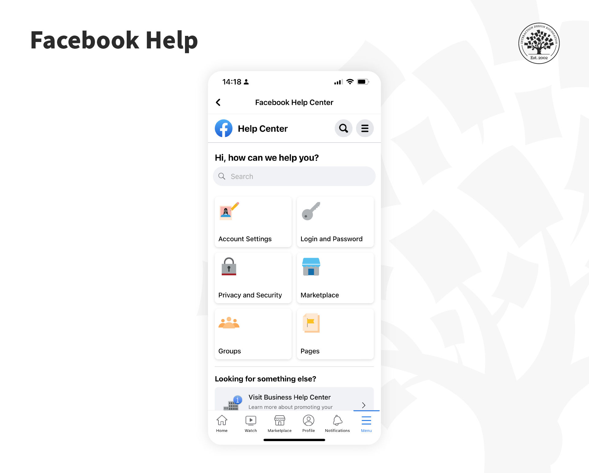
For example, if a Facebook user gets locked out of their account, they will need help!

The Facebook Help Center recently underwent a redesign; it features a more streamlined and user-friendly interface with improved search capabilities. © Facebook, Fair Use
Help is for more than just those emergency cases, most notably contacting customer support. This is a challenge because the business model in the Gig Economy is to hide contact and make it very difficult to talk to a human. Ethical UX should say that contacting customer support should be easy and transparent (not require circular loops and drill-downs to find that magic contact link).
In some cases, help can be part of the UI experience, such as with onboarding. However, be careful you don’t default to onboarding—you can tire users and lose their interest or motivation by making them walk through help-like screens. Streamlined and the right information a user needs is critical to effective app onboarding. Test with users to be sure.

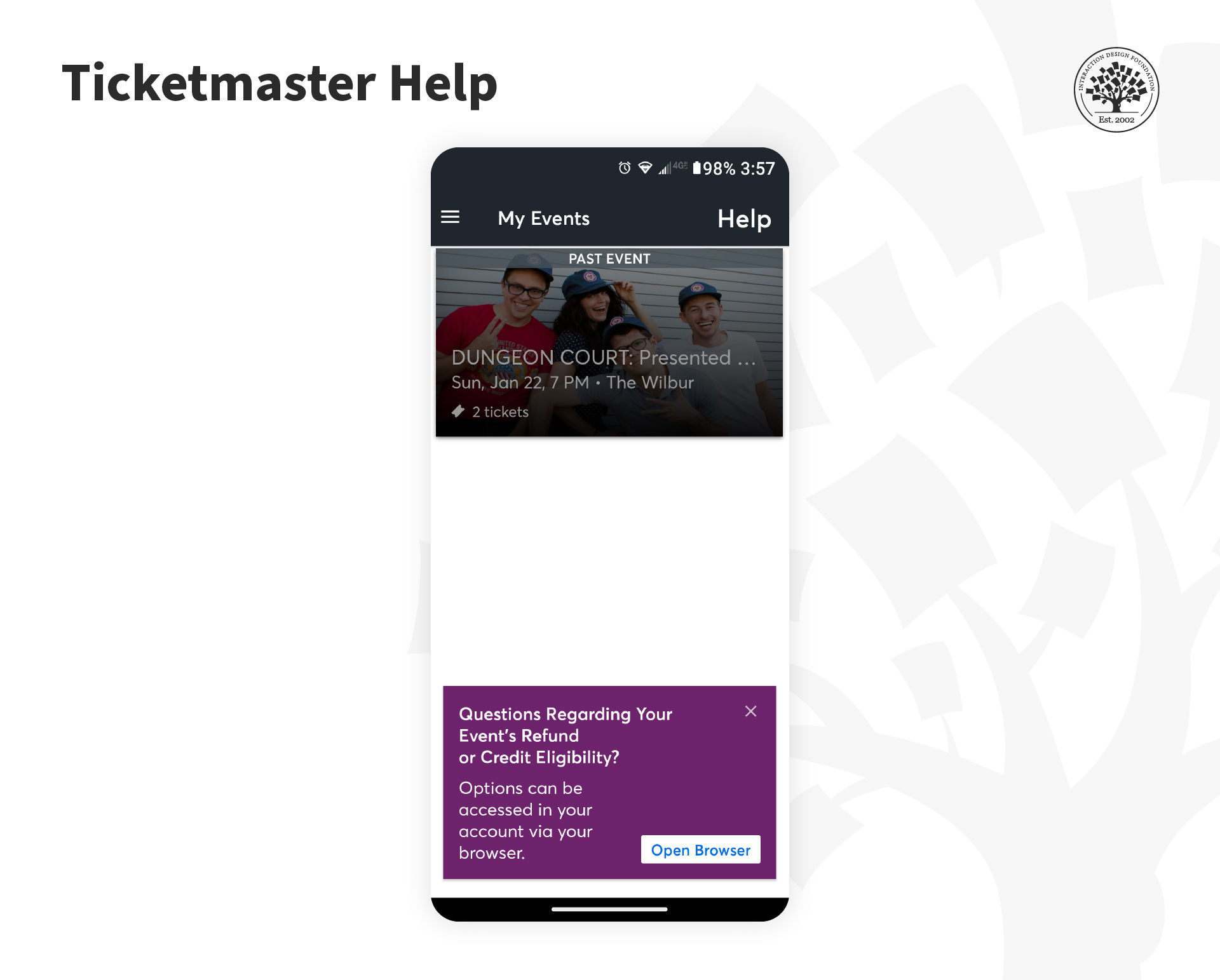
Ticketmaster offers its users visible help in the Events screen. © Ticketmaster, Fair Use
The general best practices to provide help consist of a shortlist of five simple steps to aid the user:
To place the help contextually, such as in the Ticketmaster app, is a good idea. Users might have a question or issue about the transaction that just occurred.